Monitoring Your Campaign's Performance
Campaign reports give you vital insight about the performance of your Review Request and Customer Experience campaigns. Each group of reports is pulled from its respective campaigns, are categorized under 'Campaign reports'.
Review Request Reports
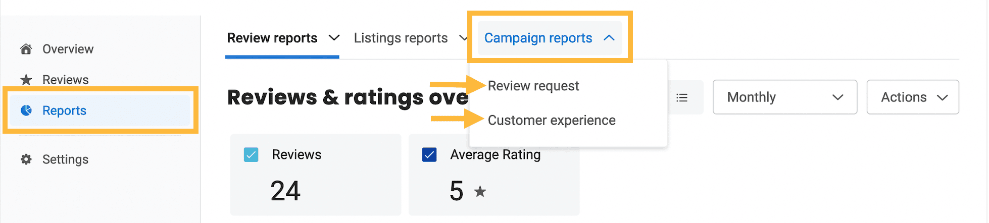
Hover over 'Campaign reports' and select the 'Review request' option to see how your Review Request campaigns are performing.
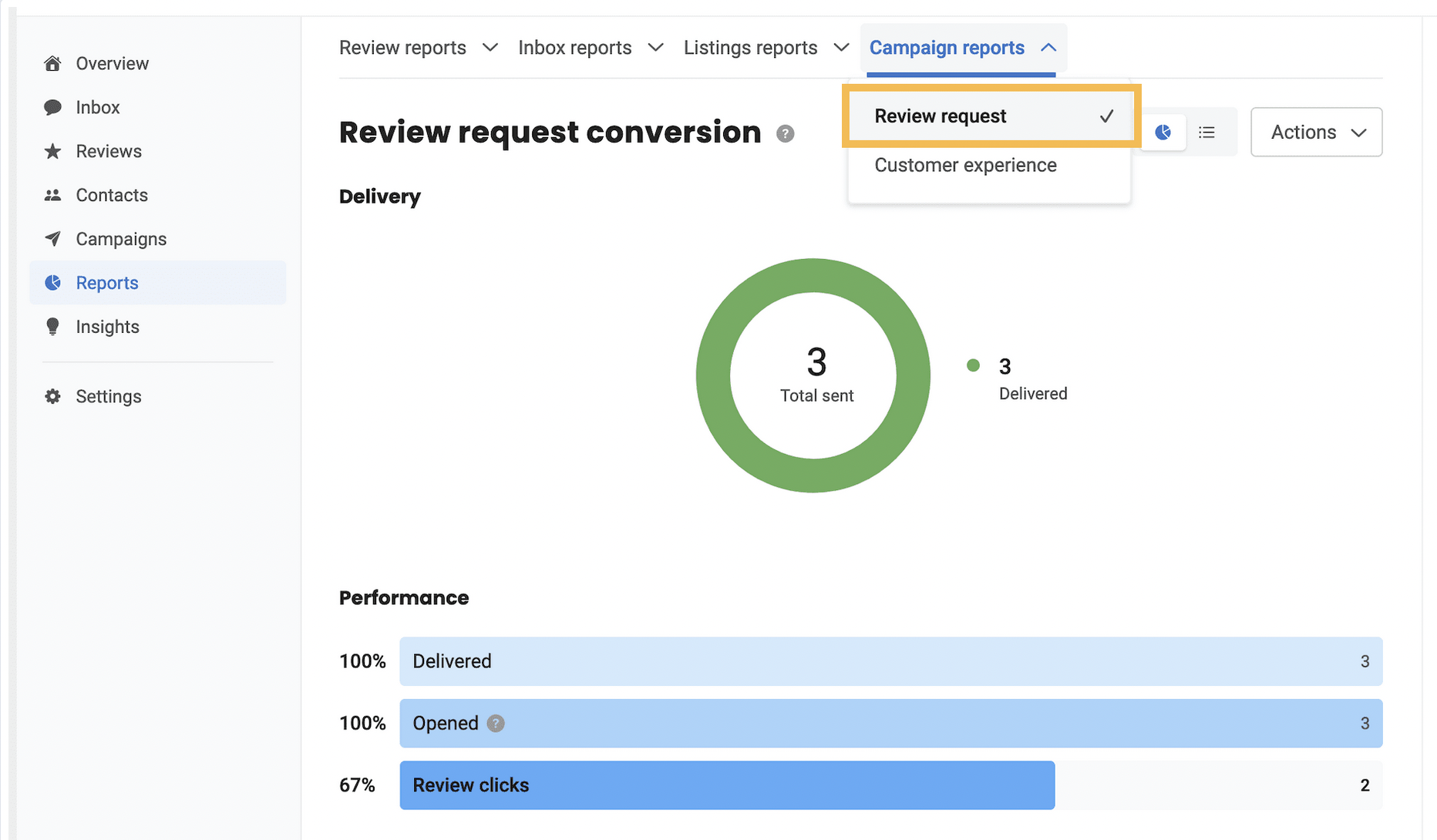
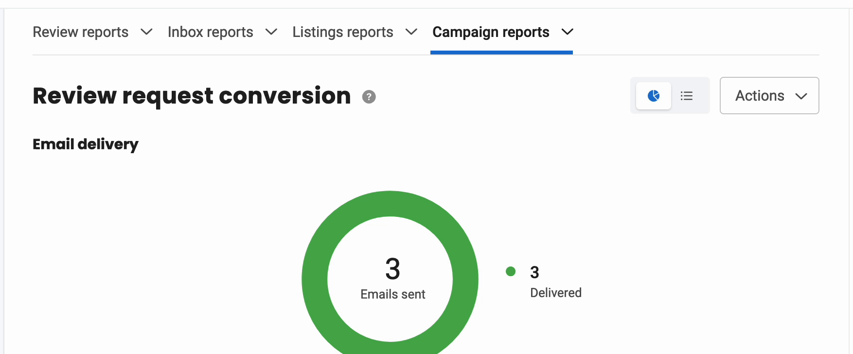
Here, you'll find reports categorized into three sections: 'Contacts', 'Email', and 'Text'. You can move between these categories in the right sidebar. Each one shows the number of messages sent, delivered, opened, and clicked.
Contacts report filter: Shows the overall number of contacts to whom review requests were sent.
Note: If you send messages to both the email and phone number of a single contact, Get Reviews interprets it as a single entry under the ‘Contacts' filter. So you'll see the total number of unique contacts to whom a message has been sent, not the total number of messages sent.
Email reports filter: Shows the number of review requests sent via email.
Text reports filter: Shows the number of review requests sent via text.
Customer Experience Reports
To view your Customer Experience reports: Click 'Reports' in the left sidebar, then hover over ‘Campaign reports’ in the top tab bar, and click on the ‘Customer experience’ option.
There are four different report types available (click any report type for more information):
Customer experience conversion funnel
- Sent
- Delivered
- Opened
- Sentiment clicks
- Review clicks
Customer experience sentiment
It shows the count and percentage of positive, negative, and neutral responses received through email and text, and can be viewed in graphical as well as tabular formats.
You can view the percentage of Promoters, Passives, and Detractors below the graph. You can also view this information when you hover over the graph.
Customer experience sentiment over time
As the default view shows the monthly data, click the ‘Monthly’ drop-down menu to view quarterly or yearly data.
Customer experience sentiment by location
NOTE: This report type is only available if you are subscribed for multiple locations.
By default, the graph shows the data for Promoters. To view the data for Passives or Detractors, click on the corresponding radio button. To change the order of the data, click on the ‘Descending’ drop-down menu, and change it to 'Ascending'.
Sharing Your Reports
From inside any report, click on the 'Actions' drop-down menu in order to download, email, or schedule a report to be sent at your preferred schedule.
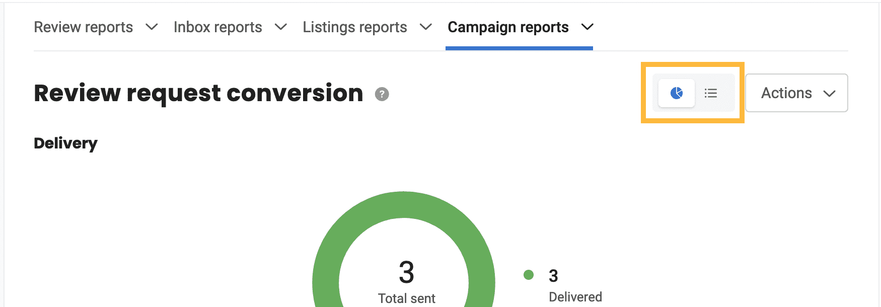
Changing Report Views
All reports can be viewed in either graphical or tabular formats. To toggle between the options, click the graph and table icons near the top right corner of any report.