
 It’s no secret—by now, you’ve heard that having a responsive, mobile friendly website for your practice is a must. In fact, more than half of all Internet searches are performed from a mobile device.
Still not sold?
Without a user friendly and engaging mobile website design, you could be missing out on a slew of new patients that local competitors are picking up. To make sure your website looks great, is easy to use, and converts visitors into new patients, consider the following tips for mobile success.
Design with the User in Mind
Smart phones and tablets have quickly become the choice web-browsing device around the world. When a user visits a website from their phone, it’s often because they’re seeking a service or product and are ready to take action.
We live in an age where we want things now, which is why it’s crucial to showcase your practice address, phone number, and map on your design. Not only is highlighting contact information helpful for new patients discovering your practice, but also for existing patients who need to plug your location into their GPS while en route, call to reschedule an appointment, or refer your services to a friend.
Mobile First, Desktop Second
While individuals across the globe certainly still use desktop computers to perform Internet searches, graphic designers now believe that mobile websites for dentists should be designed first with the mobile user experience in mind, and then expanded upon for desktop searches. This can include eliminating flashy banners, ads, and auto play videos that distract from what you want the user to absorb.
Proven and popular elements incorporated in mobile websites for dentists should include your own practice selling points. To determine this, you might ask yourself:
- Are you currently offering any specials for new patients?
- Are your services specialized or highly sought after?
- What sets you apart from competitors?
Think of your responsive design as an ‘elevator pitch’—with a limited screen size and time, stick with the main points that best describe your practice.
It’s all About Clicks
Ever visit a website on your smart phone and get frustrated with the difficulty of having to zoom and click small menu items? You’re not alone. In fact, this is a major cause for a high mobile bounce rate—visiting and immediately leaving a site. Sites that aren’t mobile friendly automatically feature the desktop design as a default, which is hard to navigate on a small screen.
While implementing a mobile design for your own site solves many issues, you’ll also want to make sure that call to action buttons are incorporated. Remember, if a user is visiting your website from their mobile device, they’ve got the ability to call your office right away. Featuring large, bright, and prominent call to action buttons with text like “Request Your Appointment” or “Book Today” are easy for the user to notice and helps guide their next action—to click!
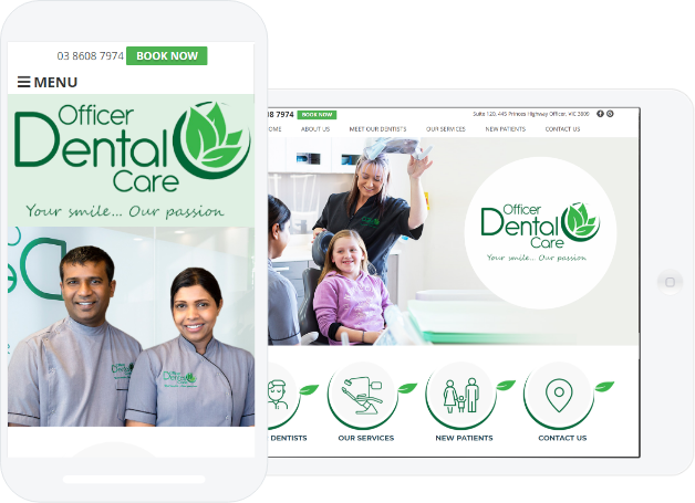
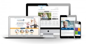
Interested in learning more about responsive dental websites? Check out some of our best design work designed with mobile in mind.