
According to Google, 85% of Americans are never farther than three feet from their smartphone. Surprised? Probably not. However, people aren’t just using their phones to make calls, text, and play with the newest app-of-the-week any longer. They’re using mobile devices to browse social media, to read online reviews of local restaurants, and even to look for a new healthcare provider.
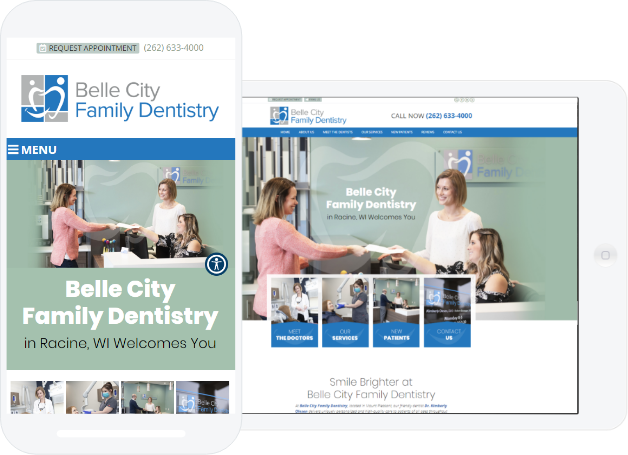
This means that if your dental website design doesn’t intelligently adjust it’s formatting to display properly on various screen sizes, also known as a responsive or mobile friendly design, you could be losing new patients.
Below, we count down the top four reasons to consider going mobile with your dental website.
1. Functionality
Whether you track your dental website analytics or not, one thing is certain: you are getting traffic from mobile searches. In fact, more people now than ever before are using a mobile device to search for places, people, and products online. If your website isn’t responsive, you aren’t making a good impression on your mobile visitors.
In fact, there’s a good chance you’ll discover the average time spent on your website from mobile traffic is much lower than those visiting from a desktop computer. Less time spent on your site equals a lower chance of new patient conversion.
2. Mobile Device Purchases are Skyrocketing
Say it with us—mobile devices are here to stay. As a matter of fact, people are purchasing iPad’s, smart phones, and tablets at an all time high with an estimated 9.3 billion set to exist by 2019.
With no signs of slowing down, the mobile market place is hotter than ever before. Without a responsive website design, your dental practice is missing out on a substantial audience.
3. Rankings, Rankings, Rankings
If the improved look and increased user capabilities of a mobile friendly website wasn’t enough to convince you of its importance, maybe this will do the trick. In the past year, search engines like Google started favoring websites that were responsive in mobile search results. This means that if a potential patient is searching for a dentist in your area on a mobile device and you don’t have a responsive website, chances are they’re never going to find you.
As time moves forward, search engines will only continue to put more weight into mobile friendly designs when it comes to local search results.
4. Effortless Accessibility
 When potential patients browsing the Internet come to your mobile website, the only thing separating them from your chair is the click of a button—literally. With a responsive dental website design, you’re able to connect with users who are ready to make a decision right then and there. After all, they can actually place a phone call to your office directly from their device.
Typically, mobile users are on the go and looking for information that is readily available to them quickly and easily. A mobile design helps you convert these types of visitors into new patients by having call-to-action buttons, content, and your practice phone number specially formatted for the smartphone screen. The easier it is to learn about your practice and make a call, the more likely they are to do it.
Interested in seeing how a responsive design functions? Check out our design gallery to view mobile friendly dental websites.