
We’ve covered the role of the call-to-action and the importance of consistency in practice branding when it comes to your dental website design. Today, we’re going to explore layout and the science behind it.
If your main goal in having a practice website is to get more new patients, then your site’s layout needs to be optimized for new patient conversion. By studying heat maps of the highest performing websites, we’re able to determine the most effective dental website designs.
What is Heat Map Analysis?
Heat maps allow you to see where your website visitors are clicking on your site, whether they’re scrolling or not, and other analytics that help you determine what is and is not working on your site. By analyzing heat maps, a dental website designer is able to use data to drive design.
Long gone are the days of seat-of-the-pants designs that are purely artistic. We can now combine art and science rather than simply relying on a hunch about what visitors do on a practice website.
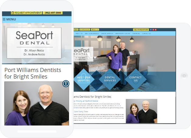
Take a look at the heat map analysis below:

This particular heat map is a scroll map and it shows how people are or are not scrolling on your website. The white sections indicate areas that all website visitors are seeing, yellow indicates an area that fewer visitors are seeing, red is even fewer, and so on to dark blue, which indicates a section of the page that is not being seen at all.
How Does this Influence Dental Website Design?
This information dictates where the most important information should be. In this case (and most cases) it is above the fold, or the area that appears in the browser window before scrolling down.
Obviously the area below that is important because we can see that potential patients do scroll down, but your dental website designer should be sure to include the most important elements above the fold to be sure all visitors see it. For example:
- Your homepage banner should be eye-catching and include a call-to-action.
- Your menu bar should be clear and easy to navigate.
- Want prospective patients to call? Make sure your phone number is prominent.
- If you prefer to send prospective patients to a contact form to send you an email, have a button directing them there.
Turn Analysis into Better-Converting Design
There are different types of heat maps available by services such as CrazyEgg that allow you to analyze more than scrolling behavior. For instance, you can see where on a page visitors are clicking the most. This may tell you that your prospective patients tend to click more on elements housed on the left side of your site. Are the most important buttons on the left side?
Or, you may see that an element you want all visitors to click on isn’t getting the amount of clicks you anticipated. This information will be incredibly useful when talking to your website designer about improving your design for conversion.
Ultimately, heat map analysis is a tool any dental website designer should be utilizing to ensure they are staying current on what does and doesn’t work when it comes to engaging potential patients and turning them into actual patients.